ordered-columns
<ordered-columns>
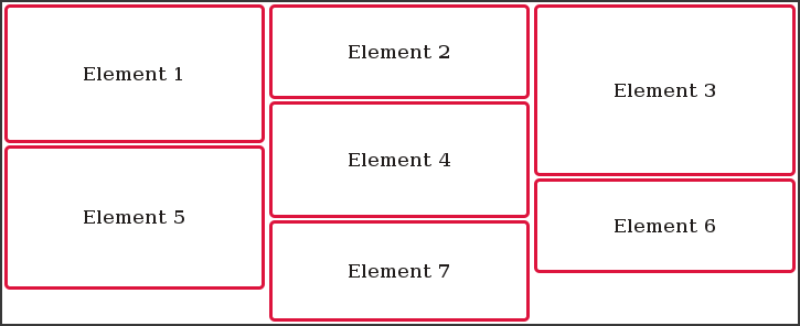
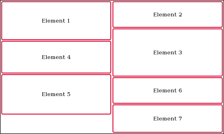
Polymer Web Component that builds vertically ordered columns (timelines) from arbitrary DOM content. Unlike CSS columns, earlier content is always rendered closer to the top of the page than later content.
Both the number of columns and column widths can be preconfigured or changed dynamically using Javascript and window resize events, ensuring elements are always rendered in the correct vertical order.
Unlike other other grid layout libraries such as Masonry, this web component rearranges DOM elements instead of using CSS repositioning. This allows better overall CSS support for styling elements, better support for flex/% based sizing, as well as retaining the ability to use nth-of-type CSS matchers.
Automatic Element Ordering
3 Columns

2 Columns

Documentation
Live Examples
Usage
-
Add the library using the Javascript package manager Bower:
bower install --save ordered-columns -
Import Web Components’ polyfill:
<script src="bower_components/webcomponentsjs/webcomponents.min.js"></script> -
Import Custom Element:
<link rel="import" href="bower_components/ordered-columns/ordered-columns.html"> -
Start using it!
Set the column count, and add content:
 <ordered-columns count="5">
     <!-- Any number of <article> or elements with role="article" -->
 </ordered-columns>
History
For detailed changelog, check Releases.
License
MIT License © Steven Skelton